At Capgemini, and for most projects, we usually create the same standard basic components for example buttons, form inputs, radio buttons, etc. These components can be time consuming to set up initially, given we need to implement all the logic like validation, user interaction, tests, documentation, QA validation, AA accessible and fix any bugs raised also. This step can take a fair bit of time and effort, especially when building solid foundations for our software. It can take up to 3 to 4 sprints for a full team to build a set of high quality common components and this is why in DCX (Digital Customer Experience) we decided to start building a library that will speed up this initial process.
Day 0: The initial challenge
When our DCX team (Digital Customer Experience) at Capgemini started building our first library we were under the impression that a component library was of the same effort as creating a web application for a client. The team were very much used to developing in client-oriented development processes, with a well guided set of requirements usually driven by a business analyst, style guide and colour palette from a UI/UX designer. Conversely, the development process of a library with no pre-defined requirements was an uncharted territory so the first question the team faced was “Where do we start?”. After a few weeks, the team came to the realisation that the strategy had to be re-evaluated and this blog post will explain the journey thus far and will share the story of the development of the dcx-react-library.
Day 1: Why do we need another library?
Sometimes a developer may suggest using bootstrap or react-material for the UI. After all, these libraries already have a pre-built set of components that will speed up our development. The problem using these common libraries is that our clients’ brand and project requirements need the UX to be specific and unique.
We’ve tried it many times before and it hasn’t worked. We really need our own set of base components… no hold on I got an idea… what about if we go on Google and research some components we need and we can import into our project? That should work.
Well, occasionally a third-party library works but after few months you may regret your decision for several reasons, such as:
- My project has custom requirements the library can’t support. You could create a ticket on the GitHub project in the hope that the owner implements it. Hopefully within a few weeks or a month. Hopefully.
- There’s a bug. You create a ticket on the GitHub page, and no one replies to you, all the while your client is pressuring you to resolve the problem that’s impacting all their customers.
- You get lucky and the library you found and implemented looks and works great out of the box. But… the component you chose has 50 dependencies and after a while some are obsolete, and others have security vulnerabilities. It’s not long before your project is failing all the health checks.
- The component you imported is now deprecated and no longer maintained by the author.
I can easily continue listing more reasons, but I think you understand what prompted us to create our own library.
Day 2: What will our library look like?
After we all agreed that relying on different libraries is not a sustainable approach, we started to think how we could build a library that can be used by all our clients and what kind of components we need to create.
We didn’t want to repeat the same mistakes and limitations we saw in the other libraries, so we decided to implement our library our way:
- Style agnostic: all components are built without styling, so consumers are able to style components as desired based on a set requirements of the clients and UI/UX experts.
- Few dependencies: we don’t want to rely on external dependencies but at the same time we don’t want to reinvent the wheel, so we decided to use few external dependencies (only 5) that each have 0 dependencies themselves.
- With super-powers: Every component is both flexible and extensible, there are intrinsically built with possible requirement and use cases in mind.
- Small bundle: every possible technique should be used to provide a tiny bundle consisting of only a few kilobytes.
- Fully tested: our library will have 100% code coverage.
- AA accessible: every component is built and tested to be 100% accessible.
Day 3: How will we add documentation to our library?
I used to Google a lot, looking for the next cool library to use but I’m simply not patient enough to read thousands of lines of code because a library isn’t well documented. I know it’s really boring for most developers to write good documentation but if we want someone else to use our library, we honestly don’t have a choice.
Our documentation contains around 190 stories, is organised by components and each component has 4 main sections:
- Documentation: explains the aim of the component with a simple example and lists all the available properties while providing a detailed description for all of them.
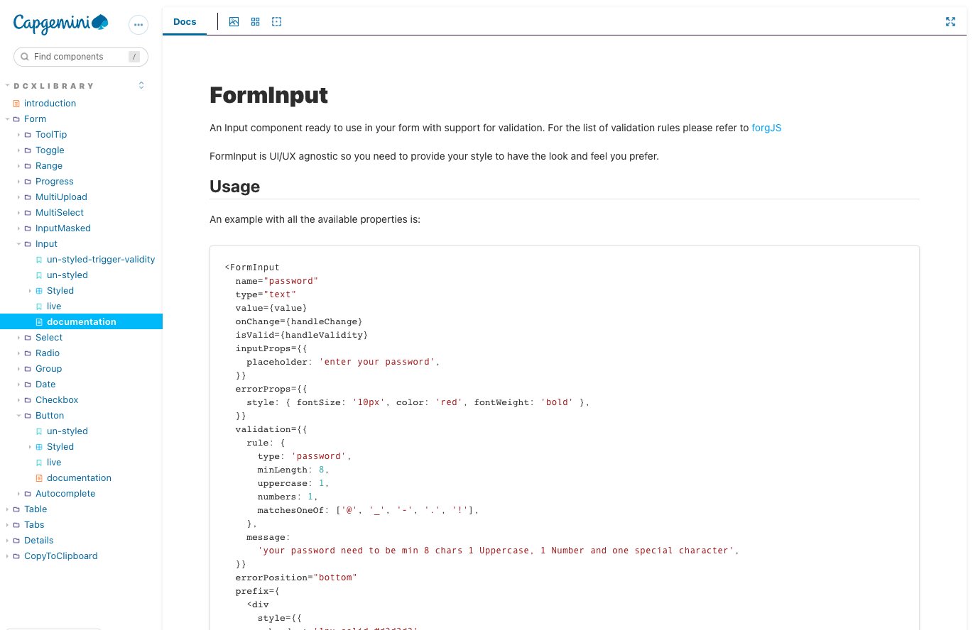
- Un-styled: UI/UX designers may be shocked to see this section because they’re going to see how the component looks naked, without any styles applied.
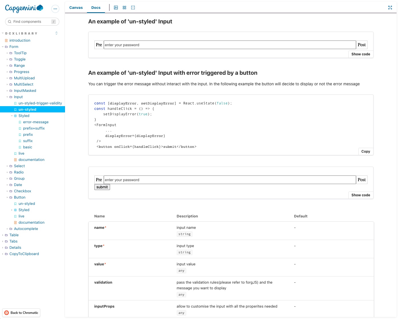
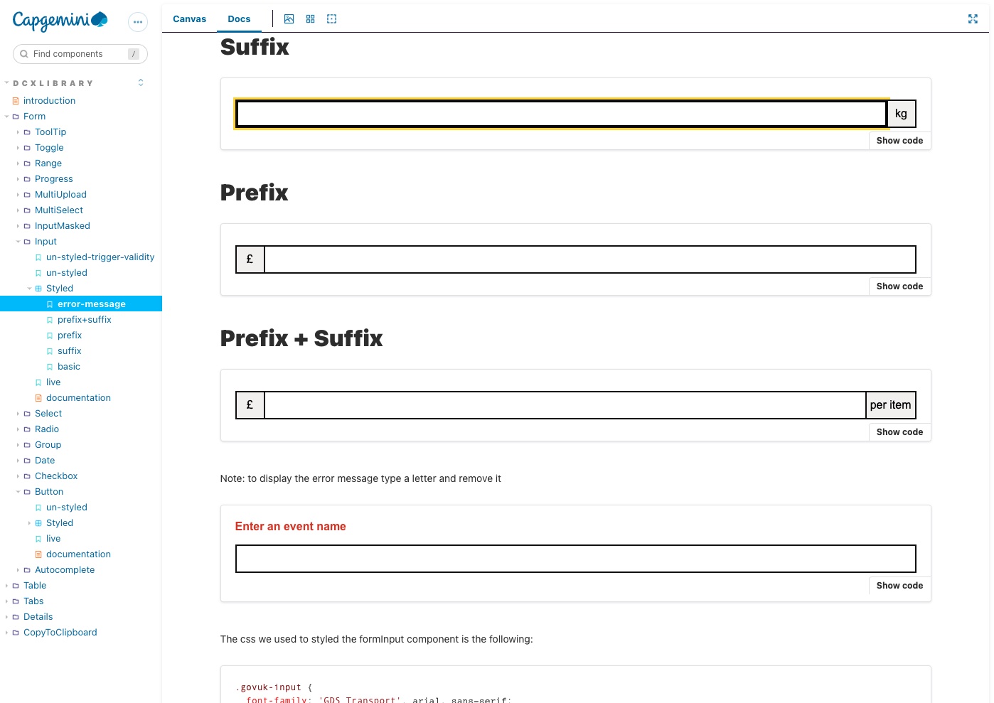
- Styled: UI/UX designers will feel better here. In this section we provide an example of how the components look once a style is applied. We also provide the code and CSS that can be copied for use.
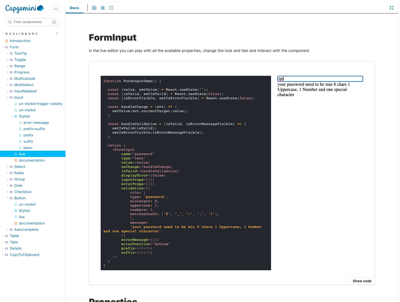
- Live: this is the section that we love the most. In this section developers can interact with the code, adding and removing properties to see how the component renders.
Day 4: How many components have we built so far?
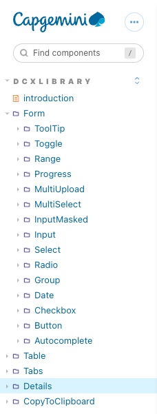
OK, I need to come clean… we didn’t just spend 3 days getting to this point. It’s taken considerably more and at the time of writing this post we’ve released version 0.3.6 into production, and we’ve already started working on version 0.4. The library has more than 20 components and most of them are being used in some of our client projects.
We look forward to creating more and will continue to listen to our developers and clients, adding more functionality and simplifying the usage of the components.
What’s next?
-
If you’d like to know more about the library, feel free to contact Daniele Zurico or Isaac Babalola.
-
If you curious to give it a try, it’s publicly available on npm.
-
If you’d like to contribute, you will need to request access from our private repository.
-
If you want to familiarise with all the components we built, take a look at our storybook documentation.
