Introduction
At Capgemini within the DCX (Digital Customer Experience) team we have built and released the first style-agnostic React component library, which provides consumers with a suite of tested React components that can be re-used within any React front end thereby speeding up the process of beginning a new project.
In a previous blog post we introduced the DCX React component library and in this blog post I will be explaining the process by which we created the library and how you can contribute to the ever-growing list of React components.
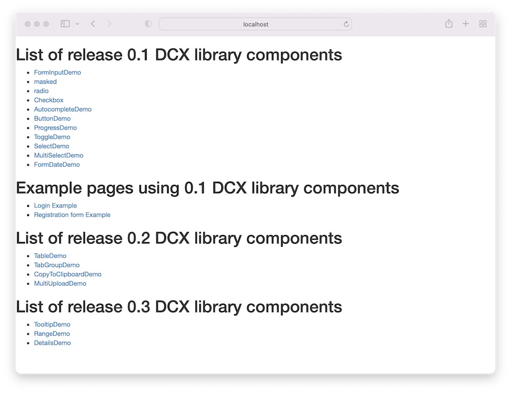
At the time of writing this post, a 0.4 version of the library was released to the public npm registry where the full suite of currently available React components can be viewed within the storybook.
Assumption
As I will be explaining the process by which we created a React component library, it is assumed that you are familiar with JavaScript, React and TypeScript.
Stage 1: Creating the library
Based on the growing popularity of yarn over the last 5 years and the performance benefits over the npm package manager we decided to use this as our package manager.
During our initial research for tools to help build the component library we noticed that the React ecosystem for building web applications was quite saturated with tools like Create React App (CRA), Next.js and Remix but the options for building a React component library were limited.
To create the library, we opted to use microbundle, which is a “zero-configuration bundler for tiny modules”.
The microbundle is a wrapper around rollup with predefined defaults such as minification and compression that produces nicely formatted stats, multiple target formats, ES modules, CommonJS and UMD.
The bundle sizes are small because we made a conscious effort to avoid importing external libraries, thereby minimising our dependency on external code, however in some cases to avoid reinventing the wheel we selectively imported libraries like lodash with a small number of external dependencies to reduce our exposure to vulnerabilities.
As you can see below, the library’s bundles are small and available in multiple targets:
  10 kB: dcx-react-library.js.gz
  8.9 kB: dcx-react-library.js.br
  9.34 kB: dcx-react-library.modern.js.gz
  8.36 kB: dcx-react-library.modern.js.br
  9.92 kB: dcx-react-library.module.js.gz
  8.86 kB: dcx-react-library.module.js.br
  10.1 kB: dcx-react-library.umd.js.gz
  8.97 kB: dcx-react-library.umd.js.br
More importantly because of the benefits of type scripting we were mostly interested in the “out of the box” support it has for TypeScript.
To configure the microbundle we added the following properties within the project’s package.json file to specify where the input files are to come from, the location where the output bundles are to be placed and the directory from where the TypeScript types are placed.
{
  "source": "src/index.ts",
  "main": "dist/dcx-react-library.js",
  "module": "dist/dcx-react-library.module.js",
  "unpkg": "dist/dcx-react-library.umd.js",
  "typings": "dist/index.d.ts",
  "files": [
    "dist"
  ]
}
Stage 2: Setting up the library
To ensure that we build the library to a high standard there were several tools and processes we put in place to aid our efforts.
Firstly, we added a .gitignore file to exclude the generated file from our remote repository.
  *.log
  .DS_Store
  node_modules
  .cache
  .idea
  dist
  coverage
  .parcel-cache
  example/.parcel-cache/*
  example/build
  storybook-static
Secondly, we added both an .eslintrc.json and an .eslintignore file to enforce a number of rules to guide the standard of written code and to specify which directories should not be linted.
Thirdly, we added Jest, the testing framework maintained by Meta (formerly Facebook), to the project to aid our test-driven development.
As a precedence, to ensure the reliability of the application code we specified that all branches, functions, lines, and statements should be at 100% within the library. As it stands, we currently have 100% test coverage on the application code.
Below is the current configuration specified in the project’s jest.config.ts file:
module.exports = {
  preset: 'ts-jest',
  testEnvironment: 'jsdom',
  collectCoverage: true,
  coverageReporters: ['json', 'lcov', 'text', 'html'],
  coverageThreshold: {
    'global': {
      'branches': 100,
      'functions': 100,
      'lines': 100,
      'statements': 100
    }
  }
}
Our components have been unit tested using the React Test Library created by Kent C. Dodds
To standardise the format of the commit messages we turned to commitlint, a linter for commit messages.
Commitlint ensures that messages MUST be prefixed with one of the following depending on the content of the commit.
[build, chore, ci, docs, feat, fix, perf, refactor, revert, style, test] [type-enum]

git commit -m "build: {{ name of build config change }}"
git commit -m "feat: {{ name of feature }}"
git commit -m "fix: {{ name of bug }}"
git commit -m "test: {{ name of test }}"
Finally, as well as the above we added two web hooks to the project to run when contributors commit new code and push code upstream to the remote repository using husky
pre-commit: used to lint the content within the commit, if any lint errors are found then the commit will failpre-push: used to start a full jest test run and check for 100% test coverage, if any tests are broken or test coverage is below the set 100% configuration then the push will fail.
Stage 3: CI/CD Set up for the library
To ensure consistency in the application code on the remote branch we decided on using circleci within the git workflow to automate the continuous integration. This tool allowed us to maintain the integrity of the combined content within the main and release branches, which integrates directly with the host git repository.
The automated builds were configured with the following config.yml:
version: 2
jobs:
  build:
    docker:
      - image: circleci/node:12.22.0
    working_directory: ~/repo
    steps:
      - checkout
      # Download and cache dependencies
      - restore_cache:
          keys:
            - v1-dependencies-{{ checksum "package.json" }}
            # fallback to using the latest cache if no exact match is found
            - v1-dependencies-
      - run: yarn install
      - save_cache:
          paths:
            - node_modules
          key: v1-dependencies-{{ checksum "package.json" }}
      # run lint
      - run: yarn lint
      # run tests!
      - run: yarn test --runInBand --logHeapUsage && ./node_modules/.bin/codecov
      # deploy storybook
      - run: yarn chromatic --project-token=c6317a751fef --auto-accept-changes
Stage 4: Storybook Documentation
As with most component libraries, we created a Capgemini themed storybook which showcases all the implemented components. It includes a detailed description of each component, including a list of required and optional properties, example styled components and a live preview which gives consumers the ability to play with all the components by editing default props.
Documentation for all components are held in .mdx files within the \stories directory.
We have also used a series of addons to build the storybook.
module.exports = {
  stories: ['../stories/**/*.stories.@(mdx)'],
  addons: [
      '@storybook/addon-links',
      '@storybook/addon-essentials',
      '@storybook/addon-docs',
      '@storybook/addon-controls',
      'storybook-css-modules-preset',
      '@storybook/addon-a11y'
    ],
};
Stage 5: Contributing to the React DCX library
Introduction
The following is an abstract directory tree of the DCX React Library repository with a single component named ComponentName
dcx-react-library
├── example/
│   ├── src/
│   │    ├── components/ # add example usage of component
│   │    │   └── ComponentNameDemo.tsx
│   │    └── index.tsx
├── src/
│   ├── componentName/ # the actual component itself
│   │    ├── __test__/
│   │    │   └── ComponentName.test.tsx
│   │    ├── ComponentName.tsx
│   │    └── index.ts
│   └── index.ts
├── static/
├── stories/ # the story demo for component
│   ├── ComponentName/
│   │    ├── Documentation.stories.mdx
│   │    ├── Live.stories.mdx
│   │    ├── Styled.stories.mdx
│   │    └── Unstyled.stories.mdx
│   ├── liveEdit
│   │    └── ComponentNameLive.tsx # the editable render of the component
│   ├── Introduction.stories.mdx
│   └── style.css # styles used within the stories of the components
├── .eslintignore
├── .eslintrc.json
├── .gitignore
├── CHANGELOG.md
├── CONTRIBUTING.md
├── jest.config.ts
├── LICENSE
├── netlify.toml
├── package.json
├── README.md
├── setup.sh
├── tsconfig.json
└── yarn.lock
Now the fun part, contributing to the library. This can be done in a few ways:
- Adding a new component
- Updating documentation
- Enhancing an existing component
- Resolving bugs
- Improving accessibility
Adding a new component
The first step would be to decide what kind of component you would like to add, what functionalities the component should support based on consumer needs and how the component can broaden the breadth of the library.
After deciding on the above the first thing to do will be to add a directory for your component within the src directory.
Add a .tsx file for your component with a file name matching the name of your component e.g. ComponentName.tsx
Within your ComponentName.tsx add an initial export, for example
type ComponentNameProps = {
  /**
   * a property for Component Name
   */
  componentProperty: any;
}

export const ComponentName = ({ componentProperty }: ComponentNameProps) => {
   // implementation will go here

  return (
    // render component code will go here
  );
};
To export the component for use, the newly added component will need to be added to the component’s index.ts file, for example
export { ComponentName } from './ComponentName';
then within the src/index.ts file the full list of exports within the componentName directory can be exported by adding the following.
export * from './componentName';
Once complete with the above you can start the implementation by adding unit tests for the component within a ComponentName.test.tsx test file in the src/ComponentName/__test__/ directory.
Using the React Testing Library you will now be in a position to write a test, for example
import React from 'react';
import { render, screen } from '@testing-library/react';
import '@testing-library/jest-dom';
import { ComponentName } from '../ComponentName';

describe('ComponentName', () => {
  it('should render', () => {
    render(<ComponentName componentProperty="some-property" />);

    expect(screen..getByText('some-property')).toBeInTheDocument();
  });
});
Once you’ve added a feature to your ComponentName you’ll be able to add the component to a ComponentNameDemo.tsx file that can be added to the example/src/components/ directory, as follows:
import React from 'react';
import { ComponentName } from '@capgeminiuk/dcx-react-library';

export const ComponentNameDemo = () => {
  return (
    <>
      <h1>Demo of ComponentName</h1>
      <ComponentName
        componentProperty="some-property"
      />
    </>
  )
}
The ComponentNameDemo will then need to be added to the example/src/index.tsx file for it to be present within the example app front end, for example:
import { ComponentNameDemo } from './components';

const App = () => (
  <div>
    <BrowserRouter>
      <Switch>
        <Route path="/componentName" exact component={ComponentNameDemo} />
      </Switch>
    </BrowserRouter>
  </div>
);

ReactDOM.render(<App />, document.getElementById('root'));
In a terminal run the following to link the changes within the DCX React Library to the example folder
yarn
then
cd example
finally
../setup.sh
this will also open http://localhost:3000 in your default browser
Updating storybook documentation
Now that we’ve added our ComponentName we will now need to create a set of stories for our component.
There are four .mdx story files that we have for each component, which are:
Documentation.stories.mdx
A file to add the general description of the component along with a full list of the props the component has.
import { Meta, Story, Canvas, Props } from '@storybook/addon-docs/blocks';
import { ComponentName } from '../../src/componentName/ComponentName';

<Meta
  title="DCXLibrary/ComponentName/documentation"
  component={ComponentName}
  parameters={{
    viewMode: 'docs',
    previewTabs: {
      canvas: { hidden: true },
    },
  }}
/>

// ComponentName can be added here

// Here is where a general description of the component can be added

// Usage example added here

<ComponentName
  componentProperty="some-property"
/>

<Props of={ComponentName} />
Live.stories.mdx
A file to add a live edit of the newly created component, which offers consumers of the library a place to edit the component to observe how it renders with a specific set of props, for example:
import { Meta, Story, Canvas, Props } from '@storybook/addon-docs/blocks';
import { ComponentName } from '../../src/componentName/ComponentName';
import ComponentNameLive from '../liveEdit/ComponentNameLive';

<Meta
  title="DCXLibrary/Form/ComponentName/live"
  component={ComponentName}
  parameters={{
    viewMode: 'docs',
    previewTabs: {
      canvas: { hidden: true },
    },
  }}
/>

// ComponentName

// In the live editor you can play with all the available properties
// change the look and feel and interact with the component

<Canvas>
  <Story name="live">
    <ComponentNameLive />
  </Story>
</Canvas>

// Properties

// below are described the list of all available properties.
// the one marked with (\*) are mandatory the other instead are optional.

<Props of={ComponentName} />
Before creating the above, you will need to ensure that you have created the liveEdit/ComponentNameLive.tsx module, an example of this is:
import React from 'react';
import { LiveProvider, LiveEditor, LiveError, LivePreview } from 'react-live';
import { ComponentName } from '../../src/componentName/ComponentName';

const ComponentNameDemo = `
function ComponentNameDemo() {

  return (
    <ComponentNameDemo
      componentProperty="some-property"
    />
  )
}
`.trim();

const ComponentNameLive = () => {
  const scope = { ComponentName };
  return (
    <LiveProvider code={ComponentNameDemo} scope={scope}>
      <div className="container">
        <LiveEditor className="liveEditor" aria-label="editor" />
        <LivePreview className="livePreview" aria-label="preview" />
      </div>
      <LiveError className="liveError" aria-label="error" />
    </LiveProvider>
  );
};

export default ComponentNameLive;
Styled.stories.mdx
A file where styled stories of ComponentName can be added, all styles can be added to the stories/style.css file.
For scoped styles, a style.css file can be created within the ComponentName stories directory, with specific styles added here i.e., stories/ComponentName/styles.css
Unstyled.stories.mdx
A file where un-styled stories of ComponentName can be added, these stories will contain basic usage of the component with no styles applied.
Enhancing an existing component
Within the project’s GitHub project board we have a number of enhancements that we want to implement for the upcoming 0.5 release with details of the desired changes, below is a snippet of a previous enhancement made to the FormSelect component in the 0.4 release.
Currently when you want to pass the options you need to specify the value and the label.
  options={[{
    label: 'Recently published',
    value: 'published'
  }]}
This is perfect in cases where it is not necessary to have a different label from the value.
options={['a', 'b', 'c']}
When making such changes it is important to ensure we do not remove or break any pre-existing functionality, but we need to add extra properties to support desired enhancements.
Resolving bugs
As the number of consumers of the library increases, we may find bugs within the implemented components, we encourage consumers to raise bugs on the project’s GitHub list of bugs page.
Participating in this way offers the opportunity to investigate issues to find a solution, which often is the best way to learn a new codebase.
Improving accessibility
All components are tested for accessibility and as we grow the list of components, we aim to ensure that all components meet WCAG 2.0 accessibility standards.
If any accessibility bugs are found, we encourage consumers to raise issues on the project’s GitHub list of accessibility issues.
Thinking of contributing?
-
If you would like to know more about the library, feel free to contact Daniele Zurico or Isaac Babalola.
-
If you are interested in using the library, it is now publicly available on npm.
-
If you would like to contribute, you can do so by forking the public repository.
-
If you would like to familiarise yourself with all of the built components, please take a look at the storybook documentation.
